Coast to Coast (Fundraising Event)
Goal: Create assets for digital fundraiser
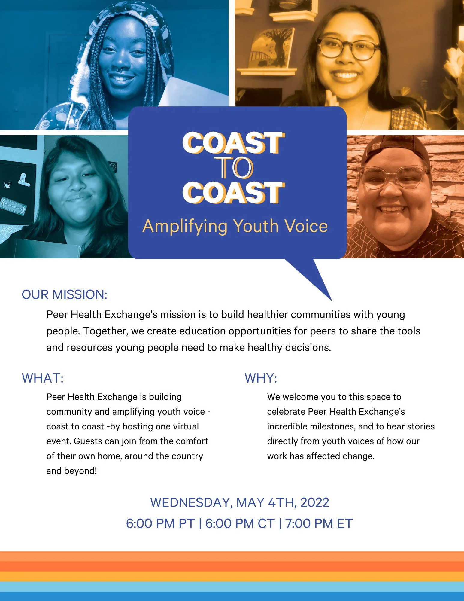
Because of how isolating lockdowns were, Peer Health Exchange’s development team wanted to highlight the interconnectedness of our national organization by naming our first fundraising event since lockdowns Coast to Coast.
The giant splashes of type with iconography I’d traditionally use worked well for in person events by giving overstimulated eyes a place to rest. However, with this event being all digital and people staring at the same walls during lockdowns, having stimulating photos for them to look at from their cold screens was important. I used images of our digital work to show how we’d adapted and classroom photos as a nod to the roots we’d return to. The lines of the US interstate system were a reminder of our real world interconnectedness on our microsite that I created the branding for and in the photo frames of pictures attendees would take from their laptops to remind us all we weren’t truly alone.